Framing
Some advice on framing and presentation.
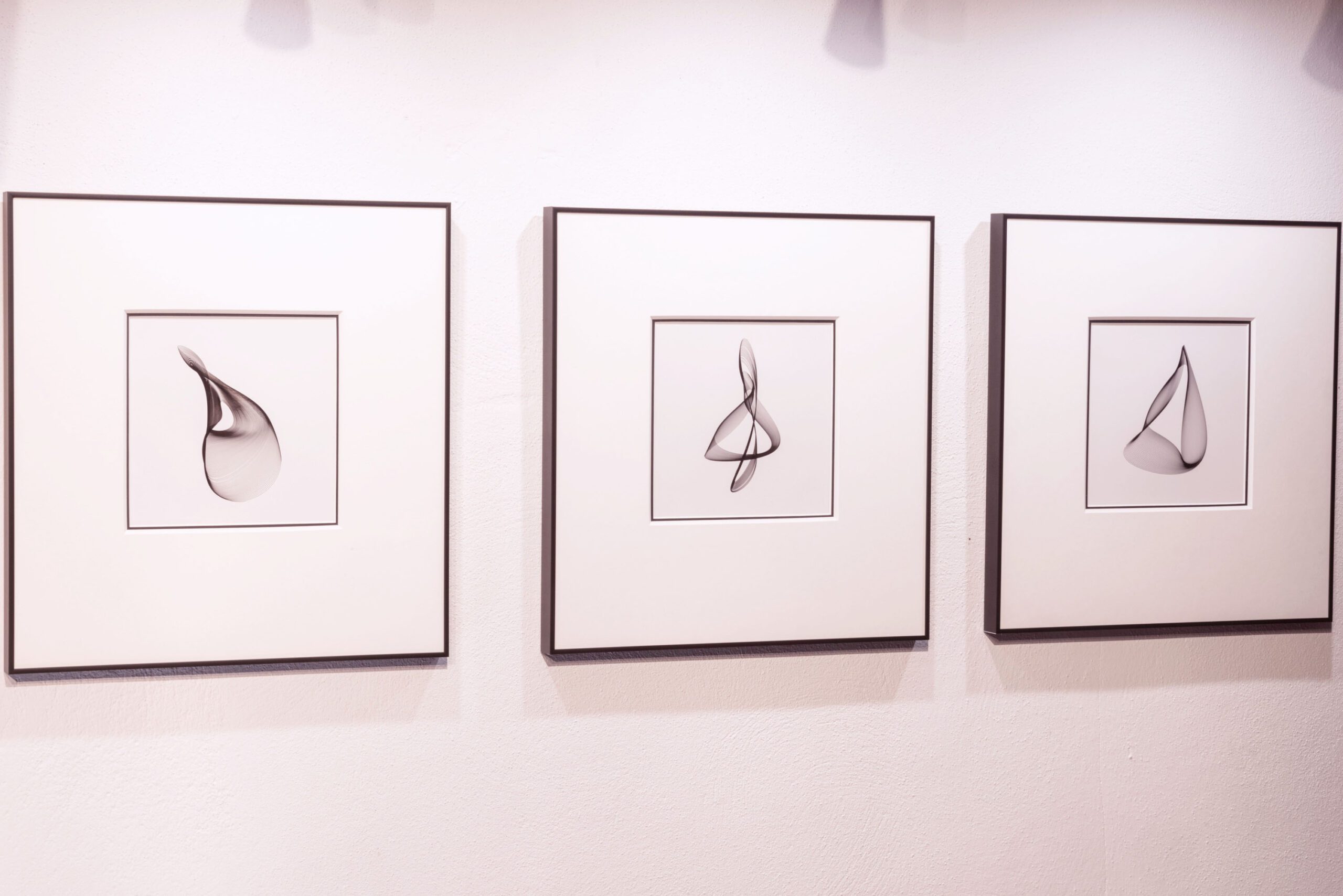
How a piece of artwork is framed greatly affects your perception of the work itself: putting a beautiful piece of work in a shoddily made or mismatched frame would detract from the work’s inherent quality. Over the years I’ve framed my harmonograms in various ways, some examples of which I’ve described here.
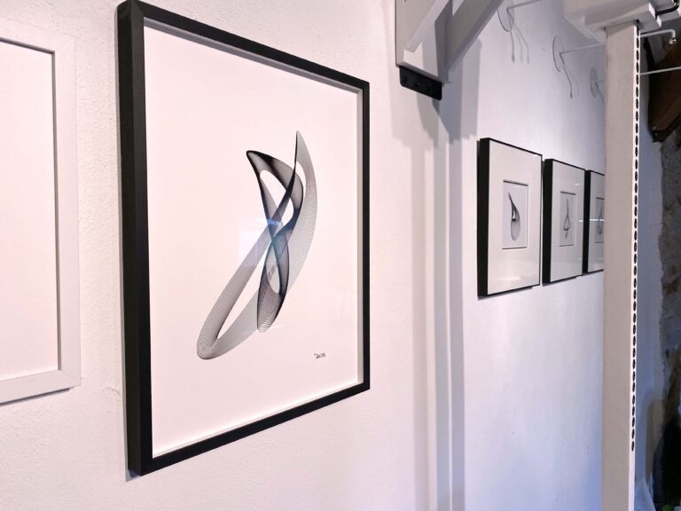
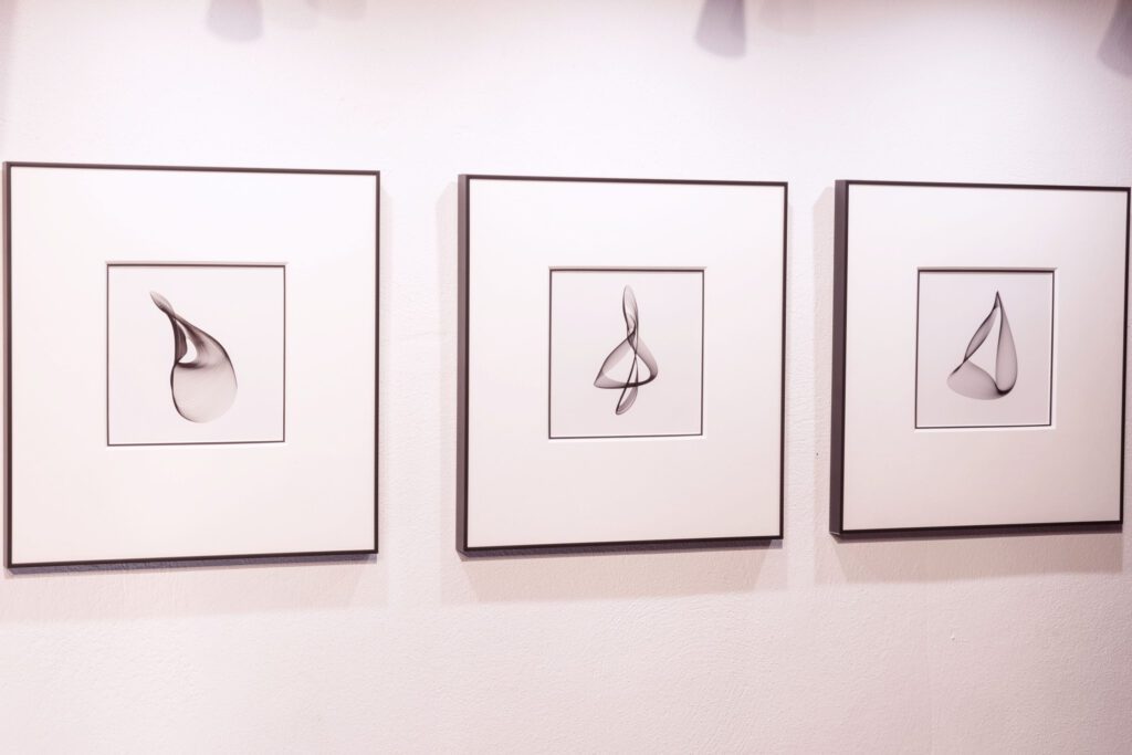
I was recently recommended a framing service called ‘Eatart’ which is based in Falmouth, Cornwall. Mark, the framer, suggested some very imaginative and creative ideas, and what we decided on is what I consider to be the best that my harmonograms have ever been presented. The frame is matt black aluminium, quite narrow (5mm) and quite deep (20mm); the overall size of this frame is 385x405mm. The harmonograms are double-mounted: the first mount is a thin black board with a white core; over this is a thicker white mount which exposes only a very narrow strip of the black. This ‘frame within a frame’ concept gives a harmonogram a very stylish and contemporary appearance: they look great as a set of three with a downlight on each.
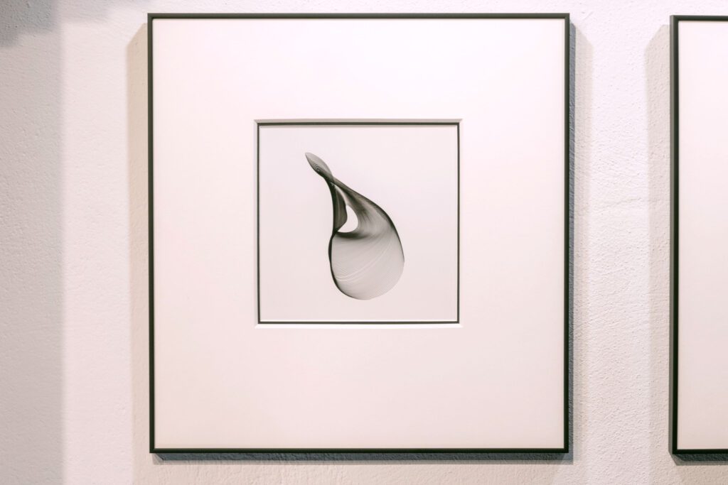
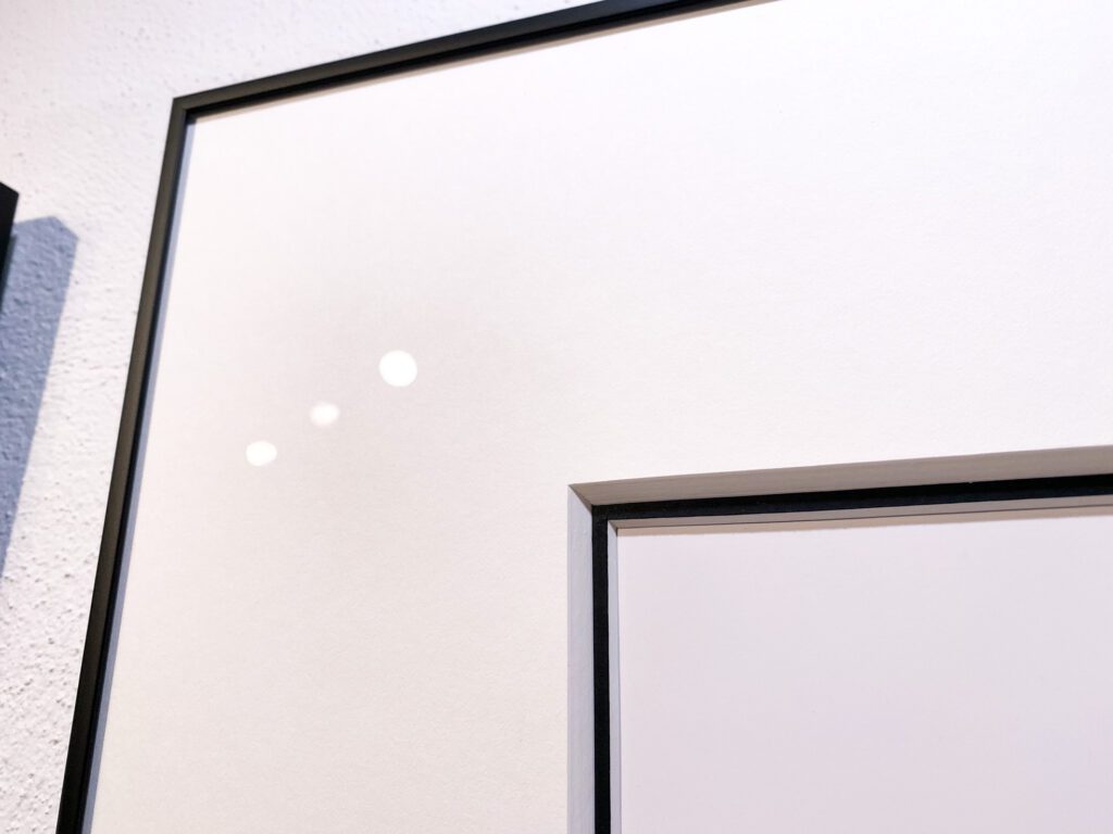
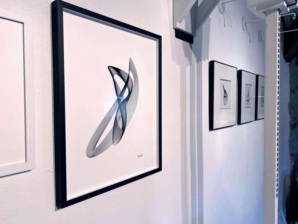
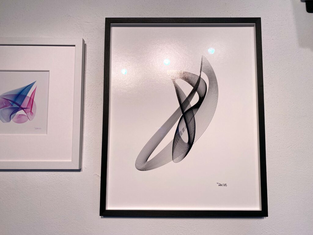
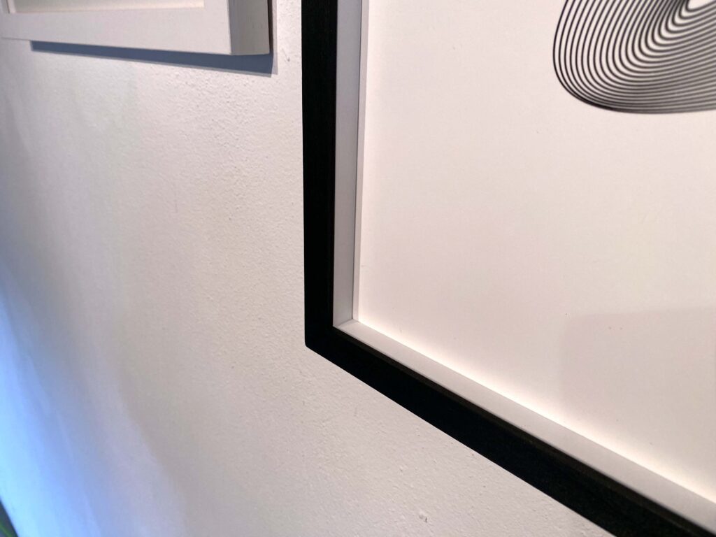
Mark also frames my enlarged prints. They are dry-mounted, meaning that they are secured to a flat board with an archival adhesive: dry-mounted artwork will remain perfectly flat regardless of changes in the surrounding environment. The frame is matt black wood 15mm wide and 30mm deep, and a spacer keeps the image and the glass apart to a depth of 10mm. The overall size of this frame is 450x555mm.
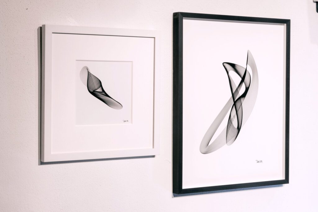
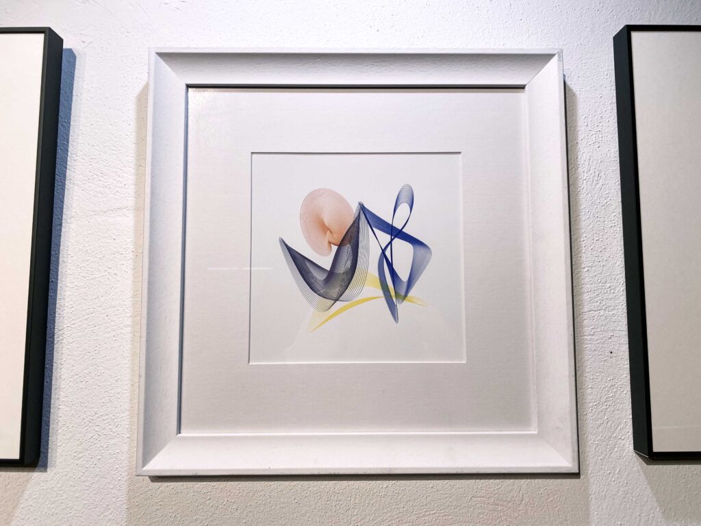
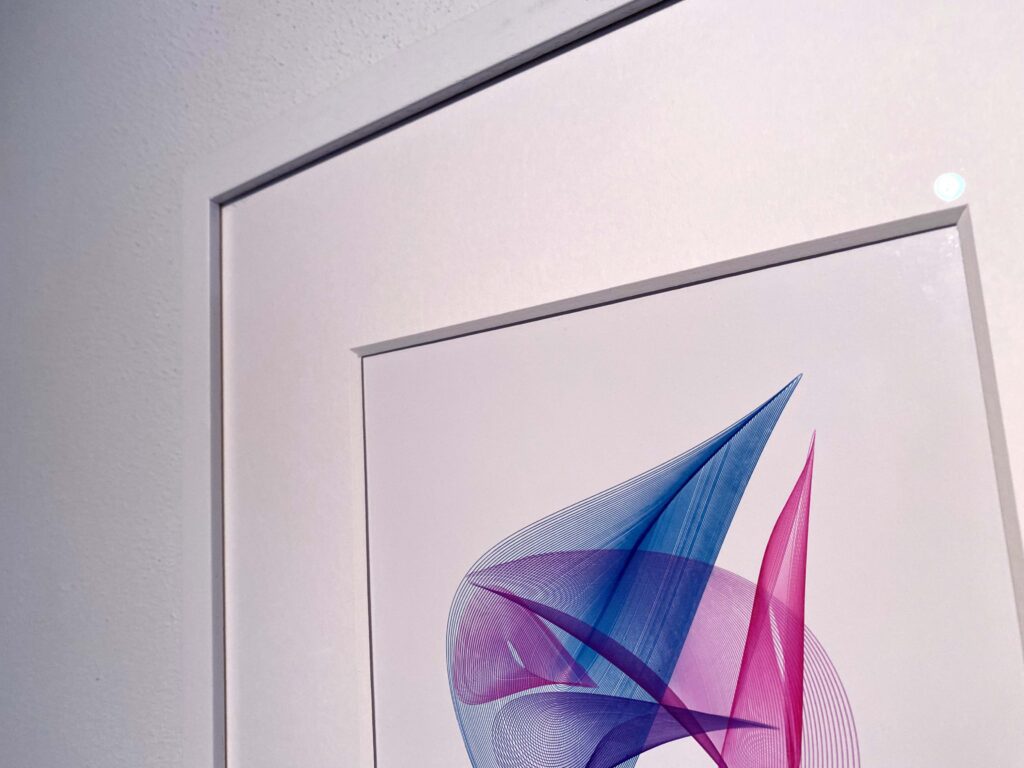
Alternatively, a harmonogram looks very good in a simple white frame with a thick or double white mount and a deep border. I always make the border at the bottom 10% deeper than the sides and top: this gives a nice balance and a ‘floating’ quality. I like to use non-reflective glass for all my pieces: it’s more expensive but worth it. Harmonograms made with coloured inks also look very good in a white frame with a deep border.
These are just suggestions: how you choose to frame a piece of work is, of course, entirely up to you.